
🔻transition 추가하기🔻
JavaScript에서 transition을 추가하기 위해 타이머를 사용한다.
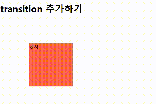
상자를 클릭하면, 회전을 하고 다시 클릭하면 회전을 멈춘다.
기본 뼈대
<!DOCTYPE html>
<html lang="en">
<head>
    <meta charset="UTF-8">
    <meta name="viewport" content="width=device-width, initial-scale=1.0">
    <title>Document</title>

    <style>
        #box {
            width: 150px;
            height: 150px;
            background-color: tomato;
            margin: 100px;
        }
    </style>
</head>
<body>
    <h1>transition 추가하기</h1>
    <div id="box">상자</div>

</body>
</html>
이벤트
    <script>

        const box = document.getElementById('box');
        let degree =0;
        let timer =0;
        box.addEventListener('click', function() {
            //타이머 제어
            if (timer == 0) {
                timer = setInterval(function () {
                    box.style.transform = `rotate(${degree}deg)`;
                    degree++;
                }, 10);

            } else {
                clearInterval(timer);
                timer=0;
            }
        });

    </script>
위 방법은 script로만 조작하는 방법으로 현재는 이벤트와 속성에 대한 변화는 자바스크립트에서 작업하고, 타이머 역할은 CSS의 transition으로 자바스크립트와 CSS 함께 사용하는 추세이다.
JavaScript + CSS 같이 사용하기
<!DOCTYPE html>
<html lang="en">
<head>
    <meta charset="UTF-8">
    <meta name="viewport" content="width=device-width, initial-scale=1.0">
    <title>Document</title>

    <style>
        #box {
            width: 150px;
            height: 150px;
            background-color: tomato;
            margin: 100px;
            transition: all 1s linear;
        }
    </style>
</head>
<body>
    <h1>transition 추가하기</h1>
    <div id="box">상자</div>

    <script>
        const box = document.getElementById('box');
        let degree =0;
        let timer =0;
        box.addEventListener('click', function() {
            box.style.transform = `rotate(${Math.random()*360}deg)`;
        });
    </script>

</body>
</html>위와 같이 작성하면 상자는 한번 클릭할 때마다 랜덤한 각도로 회전한다.
'WEB > JavaScript' 카테고리의 다른 글
| [JavaScript] change 이벤트 : 사진 슬라이더 (0) | 2023.10.12 |
|---|---|
| [JavaScript] 클릭 이벤트 : 반응형 메뉴바 만들기 (0) | 2023.10.12 |
| [JavaScript] 드래그앤드롭 이벤트 : 박스 사이즈 조절하기 (0) | 2023.10.12 |
| [JavaScript] 드래그앱드롭 이벤트 : 상자 여러개 Drag & Drop (0) | 2023.10.12 |
| [JavaScript] 드래그앤드롭 이벤트 : 상자 1개 Drag & Drop (0) | 2023.10.12 |