
🔻grid🔻
2차원(행과 열) 레이아웃을 만들기 위한 강력한 레이아웃 시스템이다.
[공통 코드]
<body>
    <div id="box">
        <div class="item">A</div>
        <div class="item">B</div>
        <div class="item">C</div>
        <div class="item">D</div>
        <div class="item">E</div>
        <div class="item">F</div>
    </div>
</body> <style>
#box .item:nth-child(1) {background-color: tomato;}
#box .item:nth-child(2) {background-color: orange;}
#box .item:nth-child(3) {background-color: gold;}
#box .item:nth-child(4) {background-color: greenyellow;}
#box .item:nth-child(5) {background-color: cornflowerblue;}
#box .item:nth-child(6) {background-color: violet;}
</style>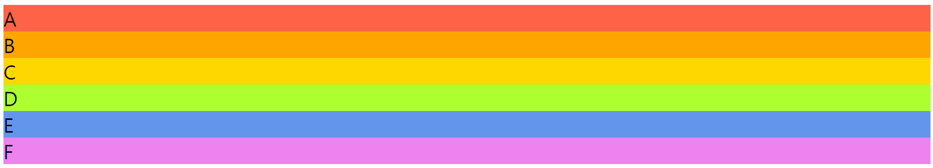
🔶2행 3열 grid 적용🔶
    <style>
        #box {
            display: grid;
            grid-template-rows: 100px 100px;
            grid-template-columns: 100px 100px 100px;
        }

    </style>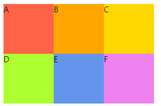
🔶repeat 함수🔶
특정한 패턴을 반복하여 정의할 때 사용한다.
    <style>
        #box {
            display: grid;

	/* grid-template-columns: 100px 100px 100px 100px 100px 100px; */
            grid-template-columns: repeat(6, 100px);

        }

    </style>
🔶fraction 단위🔶
백분율 단위로 균등분할 가능하다.
    <style>
        #box {
            display: grid;
            height: 500px;
            grid-template-rows: 2fr 1fr;
            grid-template-columns: 2fr 1fr 1fr;
        }

    </style>
🔶grid-column 속성🔶
그리드 아이템의 열 위치를 지정한다.
span 키워드를 사용하여 그리드 아이템이 여러 열에 걸쳐 있는 경우 간단하게 표현할 수 있다.
1. 시작 열 번호: 그리드 아이템이 시작하는 열의 번호를 나타냅니다.
2. 끝 열 번호: 그리드 아이템이 끝나는 열의 바로 다음 번호를 나타냅니다.
        #box .item:nth-child(1) {
            grid-column-start:1 ;
            grid-column-end: 5;
}1열부터 5열까지 자리를 차지한다.

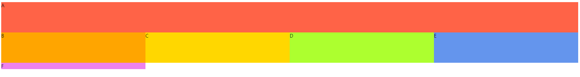
.item {
  grid-column: 1 / 5; /* 1열에서 5열까지 차지 */
}.item {
grid-column: span 4; /* 4개의 열에 걸쳐 차지 */
}🔶gap 속성🔶
- Grid나 Flexbox 컨테이너 내에서 요소들 사이의 간격을 설정한다.
- row-gap: 그리드의 행 간격을 설정한다.
- column-gap: 그리드의 열 간격을 설정한다.
🔶minmax 함수🔶
- 컨테이너 내의 열 또는 행의 크기를 동적으로 조절하는데 사용한다.
- 최소값과 최대값을 지정하여 그리드 아이템의 크기를 조절한다.
- 주로 반응형 디자인에서 유용하게 사용한다.
- 최소 크기를 설정하여 화면이 작아졌을 때 아이템이 너무 작아지지 않게 하고, 최대 크기를 설정하여 화면이 커졌을 때 아이템이 너무 커지지 않게 한다.
- minmax(min, max)
.container {
  display: grid;
  grid-template-columns: minmax(100px, 1fr) 1fr 1fr;
}첫 번째 열은 최소 100px, 최대 1fr의 크기를 가지며 나머지 두 열은 동일한 비율로 나누어져 차지한다
'WEB > CSS' 카테고리의 다른 글
| [CSS] 반응형 웹 : Media Query (0) | 2023.10.04 |
|---|---|
| [CSS]css 함수 viewport-height, minmax, object-fit (0) | 2023.10.04 |
| [CSS] 요소 배치 : flex box (0) | 2023.10.04 |
| [CSS] 애니메이션 효과 : animation (0) | 2023.10.04 |
| [CSS] 애니메이션 효과 : Transition, 전환 (0) | 2023.09.27 |